Get to Know Lynn Mandziuk
Visual Arts instructor Lynn Mandziuk teaches students to learn design "rules to break the rules."
Jasper Lipscomb | College of Arts & Media Oct 30, 2024
As is often the case with creatives, you can’t put Visual Arts instructor Lynn Mandziuk in a specific box. Her work, informed by a multi-cultural background and love of the outdoors, spans mediums and messages, but all culminates in a search for the most authentic way to tell her story. Outside of the vibrant, surreal, but very human imagery in her visual work, she’s a writer, musician, animator, designer, performer, and photographer. Bridging the gap between traditional and modern mediums is a major aspect of her creative mission and one of the concepts she explores in her digital design courses at CAM, along with the idea that you need to know the rules to break them.
1. Your creative work covers many mediums and predates your time as a professor by over a decade. When approaching art as an instructor, what do you keep in mind?
I’m someone who needs exposure to different people, things, and worlds. My goal is to leave this one having gained as much information as possible. I have a colleague who compares me to AI, as I’m always changing, gathering information, and processing it. You can always guarantee change will be a constant, especially in art, science, and technology. Therefore, I hedge my bets on taking risk, as it’s better to make an educated guess than to not try at all. I’m constantly exploring and experimenting with new ideas and concepts, like expanding my work as a musician to other styles, building circuitry, and starting improv. Part of it is about learning new things, but it’s also the idea that the more you fail, the more you can succeed. I take these experiments and experiences with me so I can look at the classroom with fresh eyes.

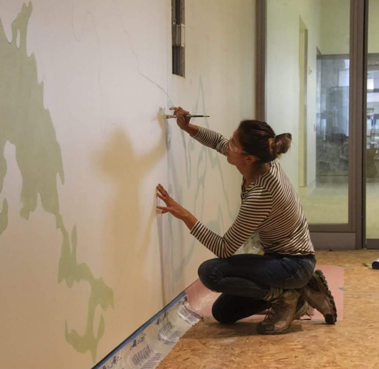
Lynn contributes to Mindy Bray’s ‘Strange Continents’ mural at the DIA Weston hotel.
2. We tend to only see a handful of fonts on our computers and when browsing the Internet. When designing more creative typography, how do you maintain readability?
That’s an interesting and subjective question, because context is everything in typography. Something like Times New Roman was created to be legible in print format, while most blogs and news online use an easily readable Sans Serif, a letterform without any extending features. Certain fonts are made as attention grabbers, headlines, or for a one-off header word. What I need to ask in response is, “do you always need to maintain readability?”
3. Design clients can range from being extremely specific about their needs to quite vague. How do you approach each of these to ensure you deliver something they’re satisfied with?
It’s hilarious, because those are the two most difficult types of clients. It can be challenging if the specific one doesn’t have the design vocabulary to describe their needs, so I try to make sure to understand where they’re coming from and what they want on a universal level. The wishy-washy ones are sometimes more difficult, so you must be willing to take the lead and say, “Look, I’m the professional,” while affirming they can be flexible and offer different options in their brand guide.

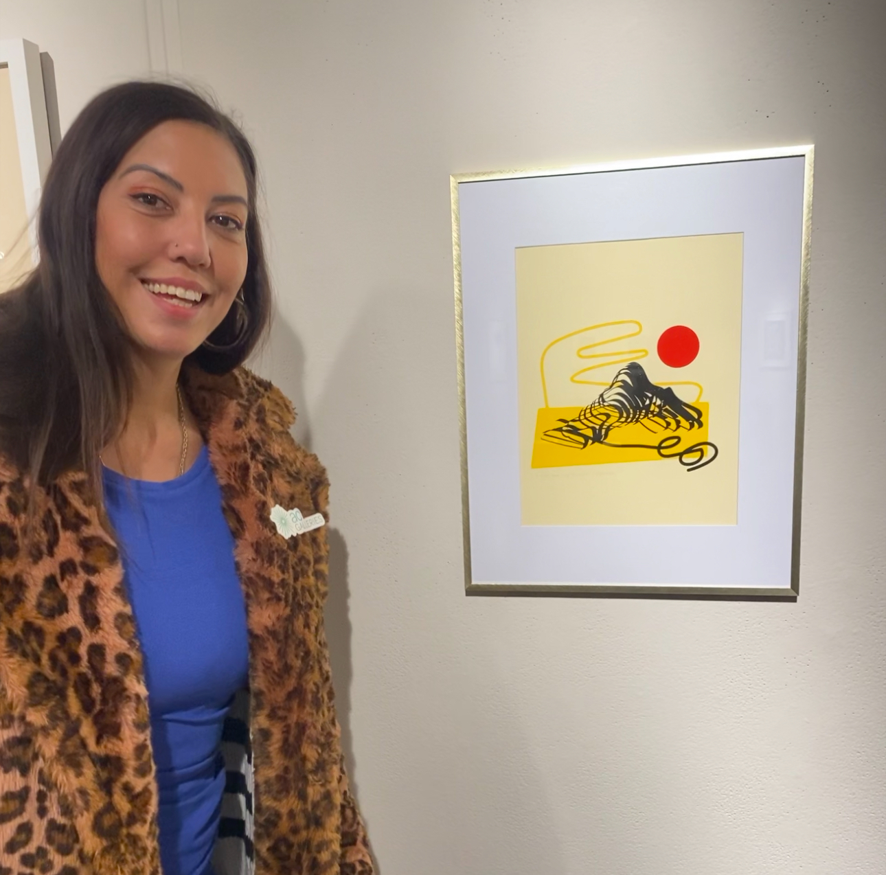
An example of Lynn’s printmaking work with ‘Unwravelling 2,’ a part of the 528.0 exhibition at Arvada Arts Center.
4. A brand is kind of an enigmatic concept that transcends the ideas it’s meant to represent, resulting in something that’s easy to glaze over. What is a brand made up of and what does the process of developing one look like?
We tend to encounter logos most often as consumers, which makes it easy for people to merge the whole brand with the logo alone, but it’s actually just an aspect of the visual identity, which isn’t all encompassing. A brand is a combination of of many things, including identity, visuals, mission, values, vision, and the actual product or service being offered or sold. I don’t think many non-designers realize this, but the process involves a lot of background research about the audience we’re catering to through data on demographics, ethnographics, psychographics, target markets, age groups, regions, and so on. Nothing is on a whim; we’re all making an educated guess, but it’s impossible to say how well it will be received or if the process will lead us to a definite solution.
Some people ask: “Well, how do you make a brand iconic?” Often times, it really doesn’t have anything to do with the design of the logo. Most of it’s a time-tested product, familiarity of a certain logo, and the resonance of the logo. Apple’s original logo was an elaborate, engraved print of Newton sitting under a tree. Today’s logo design is the exact opposite and it’s become streamlined to be just an easily identifiable apple. Coca-Cola has had the same timeless, traditional logo since the 1800s, while Pepsi has introduced a hip new logo basically every decade. It’s two completely different philosophies on moving the brand. It’s not that either is wrong or right, but it’s about the same as doing a taste test. You prefer what you prefer.
5. Climbing has been a major feature of both your identity and your design career. Why has this been such an enduring part of each?
Passion can make you feel a very specific and meaningful way. Climbing as an identity is difficult for me to talk about, as I often wonder where I’d be if I’d prioritized my creative career sooner and didn’t let it take over my life for so long. Eventually, I found I could live in my car and climb while doing design and illustration remotely. Soon, I was working for a host of outdoor industry brands and magazines, as well as clients affiliated with major sports organizations.
For me, it’s about being a better version of myself, but not being better than anyone else. It’s brought me out of some of my darkest places and was sometimes the one thing I knew would make me feel better: The tangible representation of facing all the challenges in my head. It taught me problem solving and that I find opportunity in risk and challenge, which is a methodology I now use in all my creative paths and life skills.

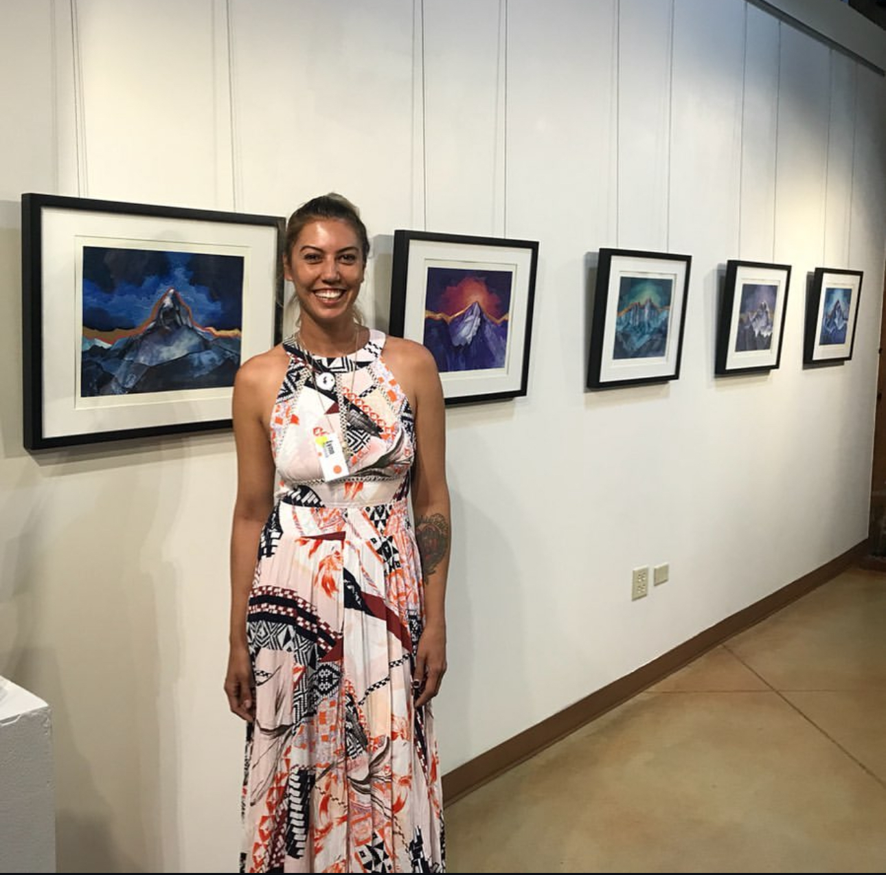
Colorado mountains represent life’s ups and downs at Lynn’s solo exhibition ‘Descendence’.